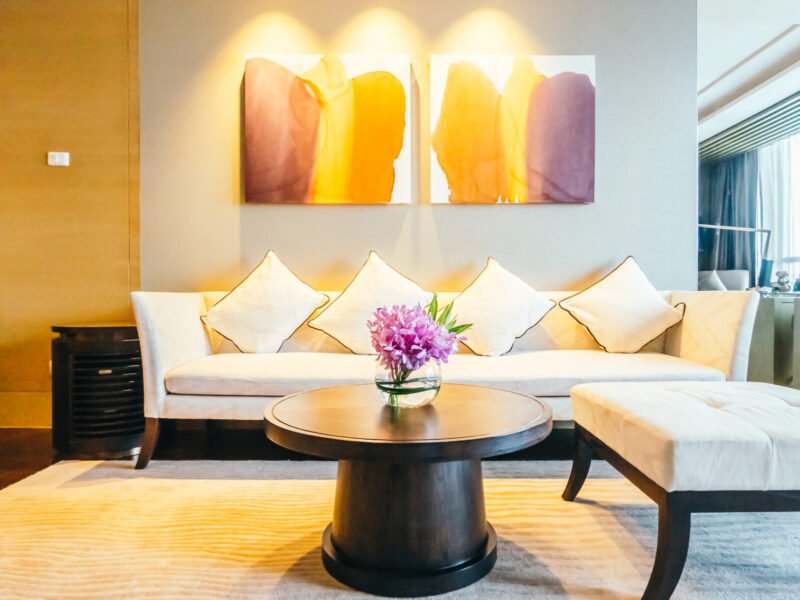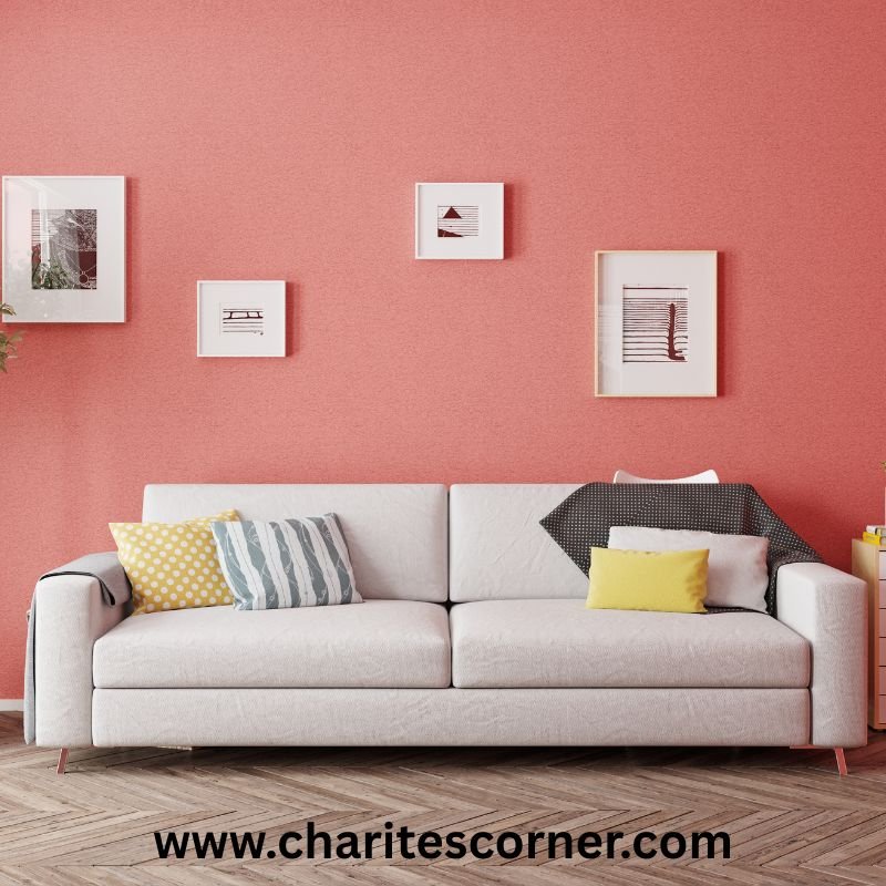
This post talks about Luxury Home Paint Colors.
The right paint color can completely transform your home. Even if you’re refreshing a single room or giving your entire house a makeover, choosing the right shade is one of the easiest ways to create a luxurious look without spending a fortune.
Luxury interiors aren’t always about bold colors or expensive finishes. In fact, many high-end homes rely on timeless, sophisticated paint colors that make spaces feel bright, elegant, and welcoming.
If you’re searching for inspiration, these luxury home paint colors can help you create a polished look you’ll love for years to come.
What Makes a Paint Color Look Luxurious?
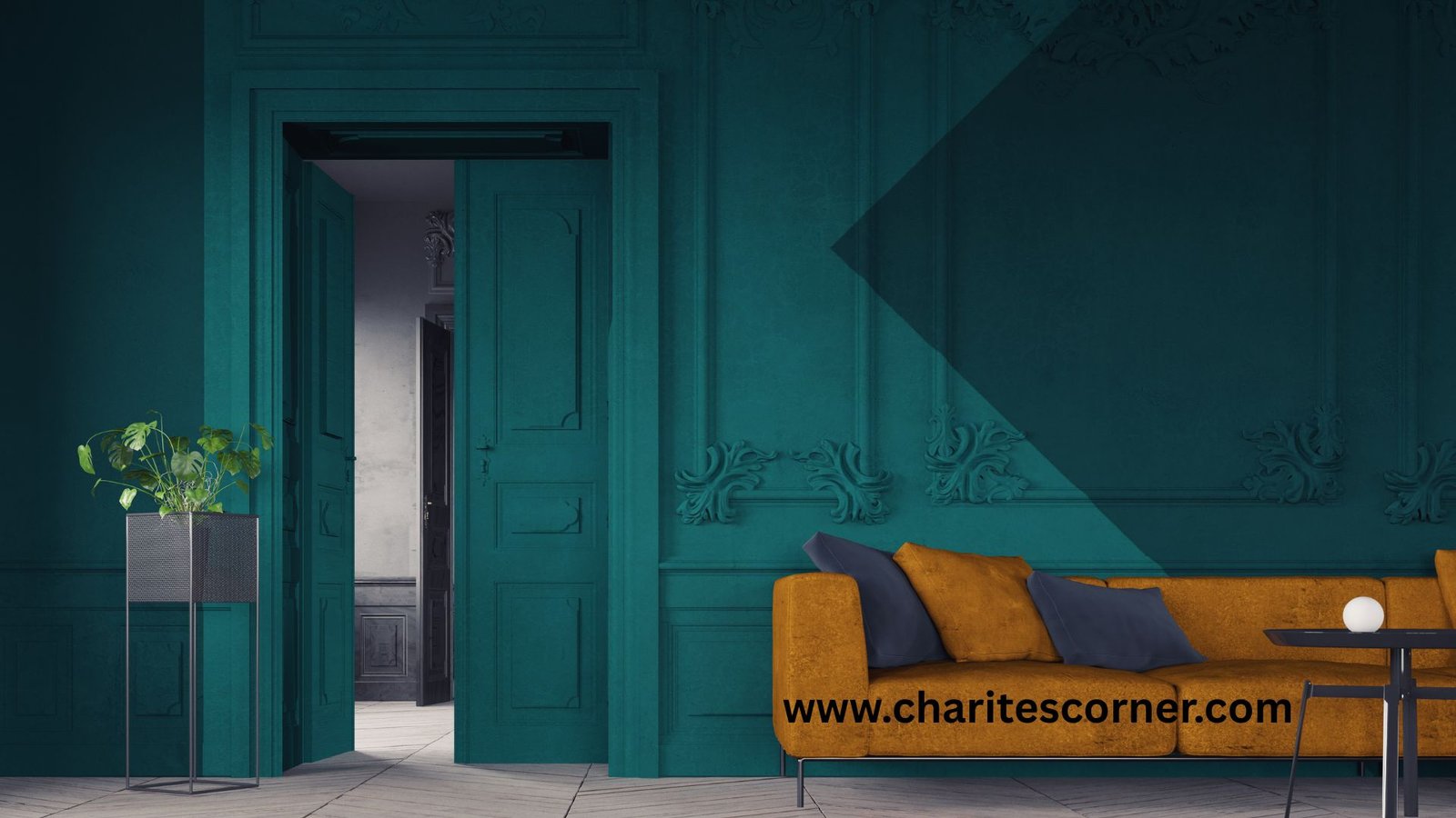
Luxury paint colors usually have one thing in common: they feel timeless rather than trendy.
Soft neutrals, warm whites, muted greens, deep blues, and rich earth tones create a calm, elegant atmosphere that works beautifully in almost any home. These shades also pair well with natural wood, stone, brass, and black accents, making it easy to achieve a designer-inspired look.
Soft White: Bright, Clean, and Timeless
White remains one of the most popular choices for luxury homes because it creates an open, airy feeling.
Instead of choosing a bright, stark white, look for soft whites with warm undertones. They reflect natural light beautifully while making furniture and décor stand out.
Soft white works especially well in living rooms, kitchens, and entryways.
Warm Greige: The Perfect Balance
If you can’t decide between gray and beige, greige offers the best of both worlds.
This versatile color adds warmth without feeling yellow and brings softness without looking dull. It’s one of the easiest shades to decorate around, making it a favorite for open-concept homes.
Greige pairs beautifully with wood flooring, linen fabrics, and matte black fixtures.
Sage Green: Calm and Sophisticated
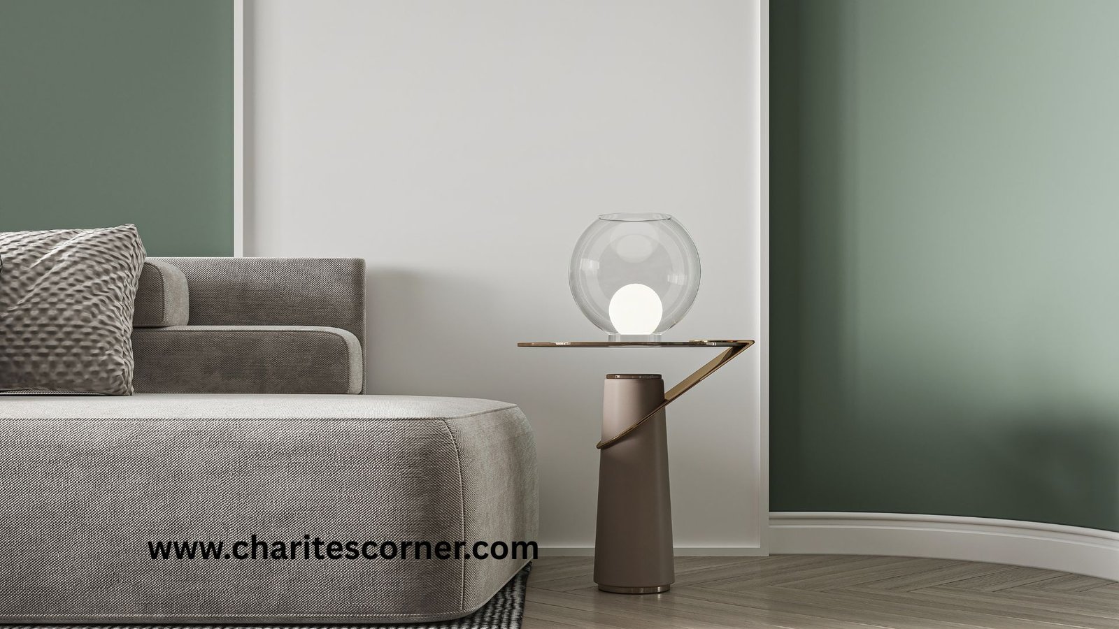
Sage green has become a favorite in luxury interior design thanks to its natural, relaxing feel.
This muted green works well in bedrooms, bathrooms, kitchens, and even home offices. It adds color without overwhelming the room and pairs beautifully with white trim and natural textures.
Deep Navy Blue: Bold Yet Elegant
If you’re looking to make a statement, navy blue is a timeless option.
Used on an accent wall, built-in shelves, or dining room walls, this rich color creates depth and instantly makes a space feel more refined.
Gold hardware and warm lighting make navy blue feel even more luxurious.
Warm Beige: A Classic That Never Goes Out of Style
Modern beige is nothing like the outdated shades of the past.
Today’s warm beige paint colors create cozy, welcoming interiors while providing a neutral backdrop for almost any decorating style.
It’s an excellent choice if you want your home to feel comfortable and elegant at the same time.
Charcoal Gray: Dramatic Without Feeling Dark
Charcoal gray adds depth and sophistication to a room without the harshness of black.
It’s especially beautiful in dining rooms, home offices, or modern living rooms where you want a little extra drama.
Pair it with light furniture and metallic accents to keep the space balanced.
Soft Taupe: Understated Luxury
Taupe is one of those colors that quietly elevates a room.
Its warm undertones create a cozy atmosphere while maintaining a clean, high-end appearance. It’s particularly beautiful in bedrooms and living spaces where comfort is just as important as style.
Muted Blue-Gray: Relaxing and Elegant
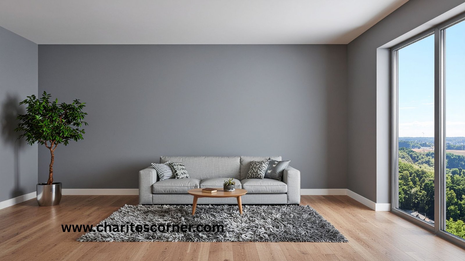
Blue-gray paint combines the calmness of blue with the versatility of gray.
The result is a soft, sophisticated color that works wonderfully in bedrooms, bathrooms, and guest rooms.
Layer it with crisp white bedding, natural wood, and textured fabrics for a luxurious finish.
Rich Olive Green: Inspired by Nature
Olive green adds warmth, depth, and character to any room.
Unlike brighter greens, olive feels grounded and timeless, making it perfect for dining rooms, libraries, or cozy living areas.
It pairs beautifully with leather furniture, brass finishes, and natural wood.
Should Every Room Be the Same Color?
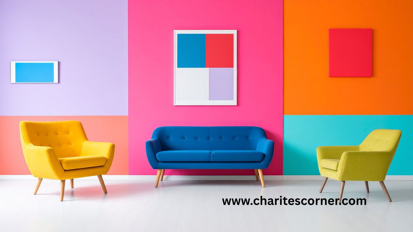
Not necessarily.
Many professionally designed homes use a consistent color palette rather than one single color throughout the house. Choosing shades that complement one another creates a seamless flow while giving each room its own personality.
A combination of warm neutrals and one or two accent colors often produces the most luxurious result.
How to Choose the Right Paint Color
Before committing to a color, test a few samples in your room.
Paint can look completely different depending on natural light, artificial lighting, and the direction your windows face. Viewing samples throughout the day helps you choose a color you’ll love in every lighting condition.
It’s also worth considering your flooring, cabinets, furniture, and existing décor before making a final decision.
Simple Ways to Make Paint Look More Expensive
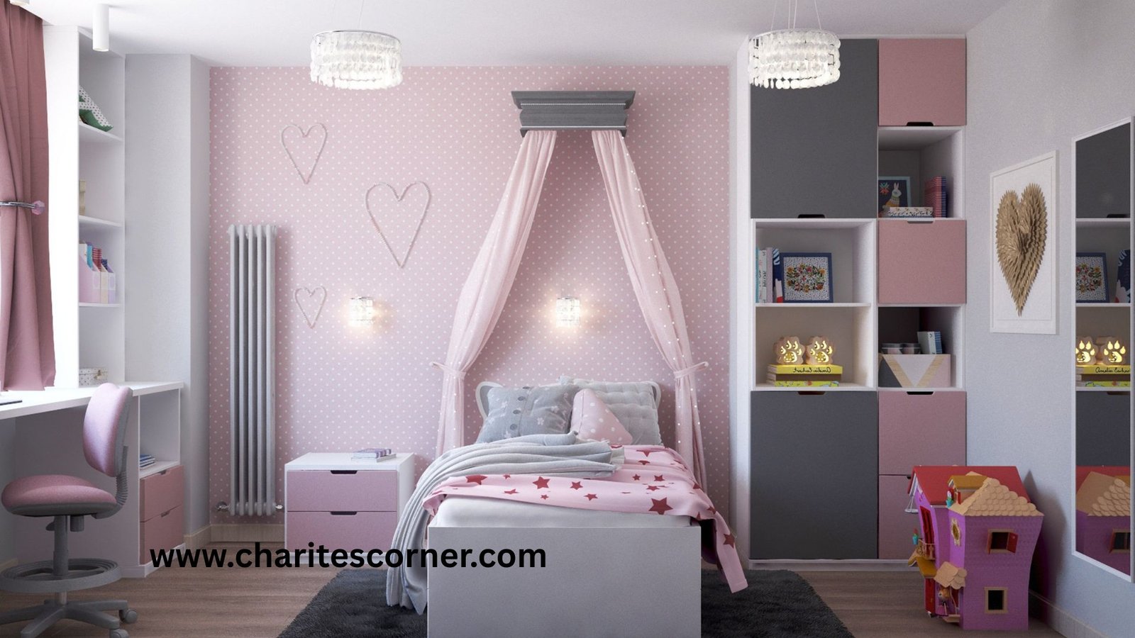
The color is only part of the equation.
For a truly high-end finish:
- Use quality paint for better coverage.
- Prepare walls properly before painting.
- Choose coordinating trim colors.
- Update light fixtures and hardware.
- Layer your room with natural textures.
- Keep your color palette consistent throughout the home.
These small details help create a polished, designer-inspired space.
Frequently Asked Questions
What paint colors make a house look more expensive?
Soft whites, warm greige, sage green, navy blue, taupe, charcoal gray, and warm beige are all popular choices because they create a timeless, elegant look.
What is the most luxurious neutral paint color?
Greige is one of the most versatile luxury neutrals because it combines the warmth of beige with the softness of gray, making it suitable for almost every room.
Are dark paint colors good for luxury homes?
Yes. Rich shades like navy blue, charcoal gray, and olive green can create dramatic, sophisticated interiors when balanced with lighter furniture and good lighting.
Should trim be painted the same color as the walls?
For a modern luxury look, many homeowners choose soft white trim that complements the wall color. In some contemporary homes, walls and trim are painted the same shade for a seamless appearance.
Do luxury homes always use neutral colors?
Not always, but they typically use a cohesive palette of timeless shades that work well together rather than following short-lived color trends.
Finally.
Luxury doesn’t always come from expensive furniture or elaborate renovations. Sometimes, the right paint color is enough to completely change the way a room feels.
By choosing timeless shades and creating a cohesive palette throughout your home, you can achieve a sophisticated look that feels both elegant and inviting.
Even if you’re painting one room or your entire home, these luxury home paint colors offer a beautiful starting point for creating a space you’ll enjoy for years to come.
YOU MAY ALSO LIKE